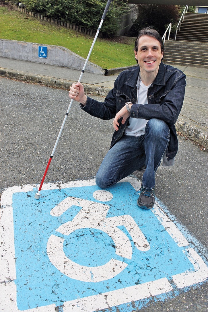
Richard Harlow was in a video conference when he heard Nanaimo city council’s vote for a new accessibility icon stream through his headphones.
“I literally screamed 'yes' and everyone in the meeting was like, ‘whoa, what?' They were pretty shocked when I started cheering,” said Harlow, a champion for the redesigned icon and director-at-large on the Nanaimo Disability Resource Centre board. “I was ecstatic to say the least.”
City council opted to swap out old wheelchair-accessible icons with new ones over time as parking signs need to be maintained.
The changed icon is a movement born out of the U.S. and arrived at Nanaimo's door step last year as Vancouver Island University adopted the new sign. Harlow would like to see it go provincewide.
The icon was created in the 1960s and updated in 1978, according to the Nanaimo Disability Resource Centre's website. The current blue-and-white icon depicts an angular figure. Its sharp lines show the mechanical features of the wheelchair more than the organic features of the human being and there's a perception the person is waiting for their wheelchair to be pushed, said Harlow.
The new graphic is a figure of a person bent forward, arm flung back as if propelling the wheelchair forward. Harlow, who is legally blind, has heard feedback that the person looks happier and like the figure is zooming around on a wheelchair with his own strength and freedom. For him, the icon is about empowerment and the message is more positive.
“We no longer use like cripple, retard, and all these other negative connotations, yet our iconography to depict people with disabilities has not changed since 1969. I would say that we've made great leaps since then in the disability movement,” said Harlow, adding that this new icon to a lot of people means strength and the ability to overcome.
“We are not asking for this to be done overnight because we understand that's a cost on the system and the old icon is still universally recognizable. If we slowly change it all throughout the city then people will get less confused as well.”
Coun. Wendy Pratt, who made the motion to adopt the new icon, considers this an update. Many things get changed over the years and this is one of them, said Pratt, who believes disabled people are becoming empowered as they seek to be included on a level playing field with the rest of their community.
On an expense level it's minimal because the city would be changing or repainting the signs anyway, she said.
The City of Nanaimo will create a strategy to implement the new icon. It's not known when the first graphic will show up on city parking stalls.
To learn more about the initiative or the Nanaimo Disability Resource Centre, please visit www.ndrc.info.
