Visitors to Maffeo Sutton Park soon won’t have difficulty remembering which city they’re in.
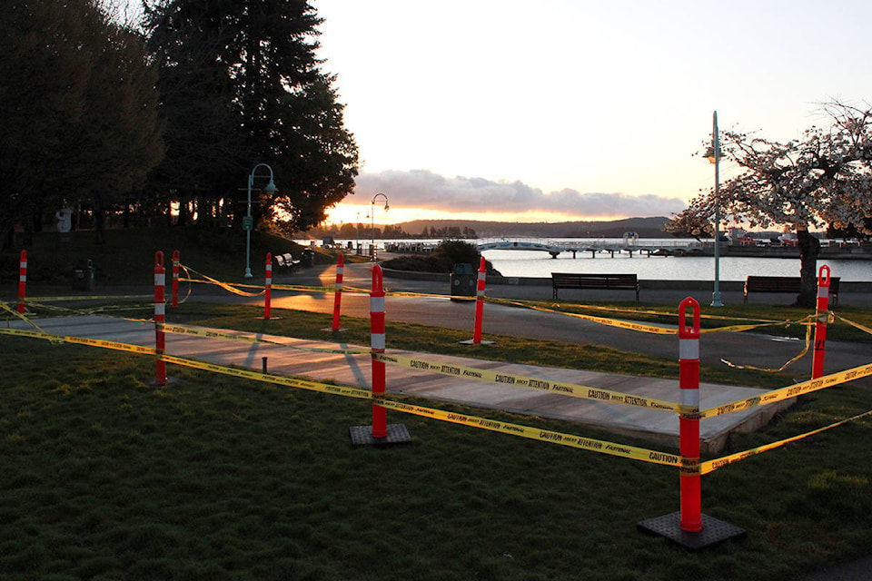
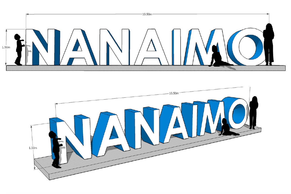
Five-foot-tall metal letters spelling out ‘Nanaimo’ are being installed upon a slab of concrete overlooking Sway’ A’ Lana Lagoon at the end of the month, Nanaimo’s director of community development Bill Corsan told city councillors at a meeting on Monday.
Corsan estimated the cost at $50,000. The sign was made by Richmond-based metal fabrication and signage company Monarch and is intended to be a permanent fixture.
“I think it’ll be popular with the public for getting a selfie or getting some Instagram photos with,” Corsan told councillors.
‘Nanaimo’ will be spelled in a font resembling Century Gothic Bold and the letters will be painted white on the front and back and blue on the sides, except for the ‘O,’ which will be multicoloured.
“The ‘O’ is the fun part of the sign where we have a rainbow of colours,” Corsan told the News Bulletin. “Depending on how you want to interpret it it can represent a few different things, but it ties in with council’s adoption of the doughnut economics model, it represents diversity, all those good things.”
Corsan said the sign was one of many projects pitched to city council in 2019 with the goal to “provide a positive attraction for people in the downtown core.” He said it follows the example of cities like Toronto and Ottawa that have similar signs.
At the meeting councillors expressed differing viewpoints on the Nanaimo sign. Coun. Sheryl Armstrong said she’s seen opposition to it on social media from people who would rather see the return of the picture frame installation that used to stand on the same spot.
“One of the things that people were saying again is that now we have three or four different ways of representing Nanaimo with different versions of lettering, etc.,” she said. “But if we’re trying to market Nanaimo we should have consistency with one type of Nanaimo sign.”
Coun. Ian Thorpe said he often visits Maffeo Sutton Park with friends and they’ve all been enthusiastic about the idea.
“I’ve had to explain what the concrete slab was going to be used for and explained about the Nanaimo sign concept. [They] loved it,” he said. “People loved it that I’ve explained it to. They think that’s fantastic.”
arts@nanaimobulletin.com
Like us on Facebook and follow us on Twitter